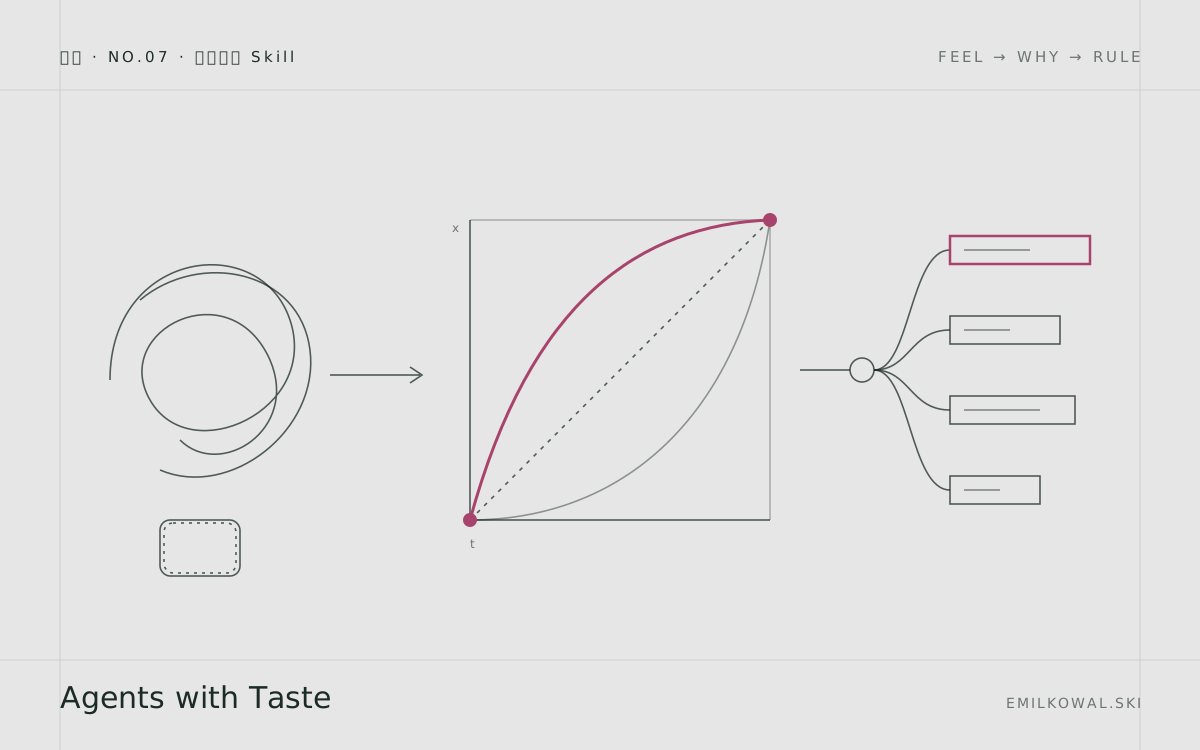
中文全文译文:由「译文工坊」根据英文原文自动翻译生成,供学习参考。结构与措辞以译文为准;想看原始论述,请点上方「阅读原文」。
得益于一整队智能体,工程师从未像今天这样拥有如此强的杠杆。但在更偏视觉的工作上,比如动画,编码智能体并不真正知道什么才是出色的手感。
我的做法是为界面的每个方面创建一个 skill 文件。如果你知道什么才是出色的手感,就把规则描述出来,再交给你的智能体,让它们照着执行。
结果是一个拥有你的品味与知识的 AI,能产出明显更好的作品,比如我用 Claude Code 做的这个可交互的 Linear logo:
传递品味
有了足够的经验,你不仅能分辨什么手感更好,还能说清楚为什么。到那时,你不仅建立了自己的品味,也具备了把它表达出来的能力。
下面正确的动画之所以手感对,是因为它从更高的初始 scale 值开始。这让运动显得更柔和、自然、优雅。
左边的 scale(0) 手感不对,因为元素看起来像是凭空冒出来的。更高的初始值更接近真实世界。就像气球,即使瘪了,它也有可见的形状,绝不会完全消失。
这就是为什么。其中没有任何魔法。只要看得足够仔细,几乎每个“品味”决策都有其合理的理由。这其实适用于任何其他领域。
当然,工作中更具创造性的部分仍然取决于你,但你能打包进 skill 的内容越多,就越能从你的智能体身上获得更大的杠杆。
既然我们知道如何说清楚某样东西为什么手感好,就可以用这些知识来指导智能体,就像指导一位经验较少的设计师一样。在这个示例中,scale 技巧和许多其他技巧都收录在我的 skill 的“实用提示”(Practical Tips)部分:
## Practical Tips

| Scenario                        | Solution                                        |
| ------------------------------- | ----------------------------------------------- |
| Make buttons feel responsive    | Add `transform: scale(0.97)` on `:active`       |
| Element appears from nowhere    | Start from `scale(0.95)`, not `scale(0)`        |
| Shaky/jittery animations        | Add `will-change: transform`                    |
| Hover causes flicker            | Animate child element, not parent               |
| Popover scales from wrong point | Set `transform-origin` to trigger location      |
| Sequential tooltips feel slow   | Skip delay/animation after first tooltip        |
| Small buttons hard to tap       | Use 44px minimum hit area (pseudo-element)      |
| Something still feels off       | Add subtle blur (under 20px) to mask it         |
打造更好动画的实用提示。
另一个示例是选择合适的缓动曲线,这是任何动画中最重要的部分。这里的规则很严格,这样智能体就不必猜测,也不用自己编规则。它只需按照流程图,根据我的理念选出合适的缓动曲线。
## Easing Decision Flowchart

Is the element entering or exiting the viewport?
├── Yes → ease-out
└── No
    ├── Is it moving/morphing on screen?
    │   └── Yes → ease-in-out
    └── Is it a hover change?
        ├── Yes → ease
        └── Is it constant motion?
            ├── Yes → linear
            └── Default → ease-out
选择合适的缓动曲线从未如此简单。
接着,我们可以覆盖动画的其他所有要素,让智能体清楚地知道每种场景下该怎么做。时长是动画的另一个组成部分:
## Duration Guidelines

| Element Type                      | Duration  |
| --------------------------------- | --------- |
| Micro-interactions                | 100-150ms |
| Standard UI (tooltips, dropdowns) | 150-250ms |
| Modals, drawers                   | 200-300ms |

**Rules:**
- UI animations should stay under 300ms
- Larger elements animate slower than smaller ones
- Exit animations can be ~20% faster than entrance
- Match duration to distance - longer travel = longer duration
UI 动画的时长指南。
你可以用这种方式把任何“品味”层面的决策打包成 skill,无论是布局、图标还是色彩理论。下面是我的某个 skill 文件中关于排版的一些规则:
## Typography

1. Cap body text at about 65ch instead of stretching full width so line length stays comfortable to read.
2. Apply `tabular-nums` to price columns so digits align and the column reads cleanly.
3. Use the `…` character instead of `...` in markup so truncation follows the container instead of snapping at a fixed character count.
4. Loosen letter-spacing on uppercase labels; tight uppercase reads cramped.
5. Declare a fallback stack whose x-height and weight match the primary face so loading does not cause layout shift.
6. Reserve underlines for links; emphasize non-link text with weight or color so underline stays a reliable affordance and people are not tempted to click inert copy.
7. Prefer bold for interface emphasis and keep italic for citations and linguistic stress in prose — italic hierarchy reads like print editorial, not UI hierarchy.所以,退一步想想:为什么做出某个决定?为什么必须这样做?把理由清晰地表达出来,定下规则,并且要严格执行。为了让这个过程更轻松,我使用了 Anthropic 的 skill-creator skill。
把你的品味打包成 skill 之后,就可以把它交给你的编程智能体使用。
下面是我让 Claude Code 借助我的动画 skill 来改进一个对话框动画。它根据我定义的规则,给出了一份清晰的问题清单,以及一张修改前后的对比表:
00:00
-00:00
试一试
我把自己的博客文章整合成了一个大型的设计工程 skill,你可以试用。它涵盖动画、组件设计、我的开源项目(如 Sonner)中的原则,等等。
获取 skill